Create Your Own Lightroom Presets: The Complete 2026 Guide
From the first Develop click to your own preset library: combine tone curve, HSL, Color Grading and AI masks so that a consistent visual style emerges — including five proven recipes to copy.
Author
Martin Kleinheinz
Photographer · Hannover
Updated
May 25, 2026
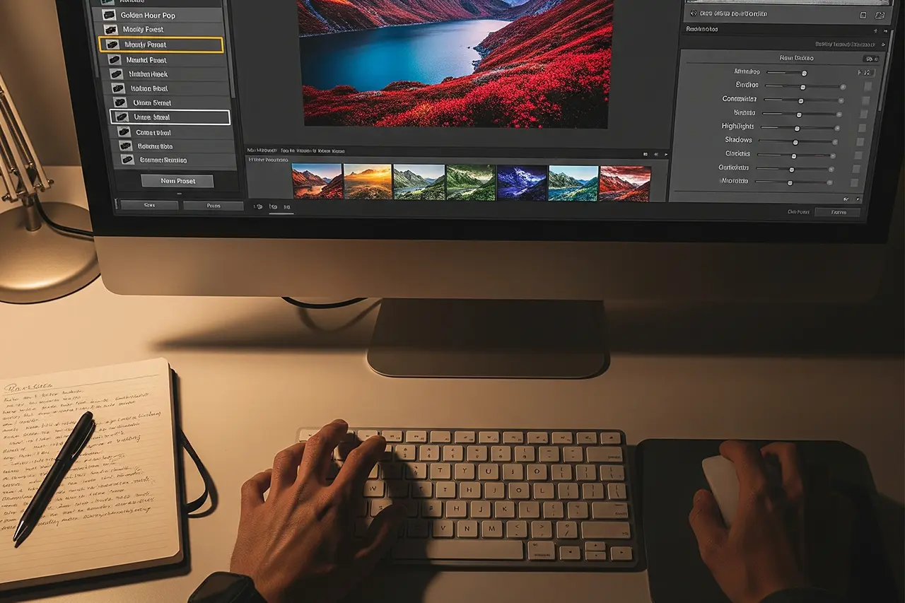
You sit in front of a screen full of RAW files and wonder how to give your images a consistent, professional look without dialing in the same 20 sliders every time? The answer in 2026 is the same as it was ten years ago: your own Lightroom presets. While bought preset packs often feel generic and over-the-top, presets you build yourself are the digital darkroom recipe that fits your style — and your camera, your light, and your genre.
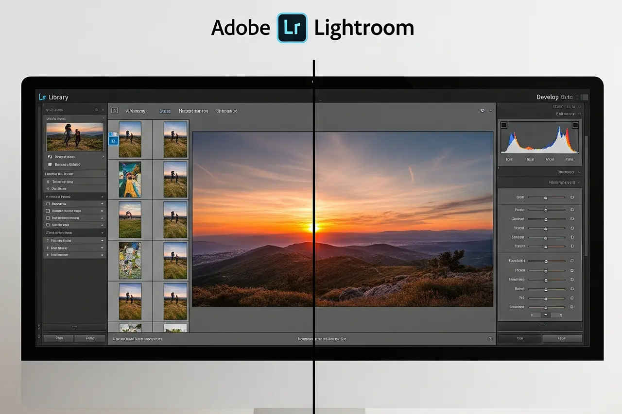
Lightroom presets are much more than filters. They store your Develop settings as an `.xmp` file and apply them to other images with a single click — since 2023/24 including Color Grading and optionally even with saved AI masks. That saves time and ensures the recognizability that sets professional photography apart — whether wedding, portrait, landscape or street.
In this guide you'll learn not just the technical fundamentals of building presets but also the concepts behind them: how pros build modular preset stacks, which settings really belong in the preset (spoiler: not all), and how to organize your preset library so it speeds up your workflow rather than slowing it down.
Everything you need is Adobe Lightroom (Classic or Cloud) and the next 22 minutes. By the end you'll be able to build professional presets that reflect your photographic vision — plus five concrete recipes you can copy directly.
00
Quick Recommendation
If You Only Have Five Minutes
The most compact version of 15 years of preset building, before we dive into the details:
Build modular, not all-in-one
An "everything" preset is inflexible. Split into at least three modules: Base (highlights/shadows/whites/blacks), Color (HSL + Color Grading) and optionally Look (tone curve). You can combine these three freely.
Exposure and white balance stay out
Both are far too image-dependent. Anyone saving exposure in the preset fights against it in 80 % of applications. Correct both before the preset click, individually per image.
Moderate values instead of maximum
Beginners push all sliders to +80, then their images look like an Instagram filter from 2016. Pro presets are usually between −50 and +50. Extreme effects come from the tone curve and Color Grading, not from saturation +100.
Test on at least 10 different images
What looks perfect on a portrait can collapse on a landscape. Before a preset moves into your main library it must pass a test set of portrait, landscape, interior, high-key and low-key.
If you're still unsure which Lightroom version is right for it, the guide Lightroom Classic vs. Lightroom (Cloud) has the answer. For everyone else: let's continue with the foundation.
01
Fundamentals
What Lightroom Presets Technically Are
Before we get practical, a quick look under the hood pays off. If you understand what a preset really is, you'll build better ones — and avoid the typical traps.
From `.lrtemplate` to `.xmp` — what happens behind the scenes
A Lightroom preset is essentially a small `.xmp` file (Extensible Metadata Platform) that stores your Develop settings as structured metadata. When you apply the preset, Lightroom reads these values and pushes the corresponding sliders in the Develop module to the saved state.
Until 2018 Adobe used the proprietary `.lrtemplate` format, which has since been fully migrated to the open `.xmp` format. Old `.lrtemplate` presets are converted automatically by Lightroom Classic on first launch — so you don't have to worry about it. What matters: `.xmp` presets work identically in Classic, Cloud, Mobile and Camera Raw.
The big advantage: Lightroom works non-destructively. Presets never change your original RAW file. All adjustments are saved as instructions in the catalog (or as a sidecar `.xmp` next to the RAW). You can return to the original at any time or create a new virtual copy with a different edit.
Why your own presets are better than bought ones
The market is flooded with preset packs, often repackaged multiple times by the same influencer. Self-built presets offer decisive advantages over purchased collections:
◆Perfectly adapted to your style — only you know which visual language you want to build over the long term.
◆Optimized for your equipment — different cameras and lenses have different color characteristics. Your own presets factor that in.
◆Flexible to evolve — your style changes over the years. Your own presets grow with it.
◆Less is more — instead of 200 purchased presets, you end up using three anyway. Better to build two of your own from the start.
◆Learning effect — building them you understand why a look works. Long term that's more valuable than any preset click.
The five preset categories that actually make sense
Not all presets serve the same purpose. Instead of a wild collection it pays to think in categories from the start:
Look presets
Give images a clear style (warm film look, cool vintage, moody editorial). These are the "hero" presets you build your visual style with.
Base / correction presets
Fix fundamental issues as a neutral starting point: gently lift shadows, tame highlights, pull back clarity. Set this as an import preset.
Genre presets
Optimized for a specific application — wedding portraits have different needs than architectural photography. Useful as soon as you really work in one genre frequently.
Creative / effect presets
For special looks: black and white, hard split toning, cross processing. Use them sparingly — they are the seasoning, not the main course.
Tool presets
Small helpers that change just one aspect — like "lens correction + sharpening" or "denoise high ISO". Perfect for batch application.
◆ Lightroom PresetsBundle
Photos with film character
9 Lightroom presets inspired by Portra, Kodak, Fuji & Ilford — for street, portrait and landscape. One-time €29, no subscription.
Preparation: The Setup Before the First Slider Moves
A good preset doesn't emerge by chance on a single image. It emerges in an environment where you can reliably see what you're doing — and on a test set that prevents your preset from only working on that one specific photo.
The test library — 20 to 30 images that decide everything
Before you develop a preset, you need a test library of different shots. Only that way you'll see whether a look works universally or whether it's tied to a specific image:
◆Different lighting situations — daylight, golden hour, blue hour, artificial light, mixed light.
◆Different exposures — correctly exposed, slightly over- and underexposed.
◆Diverse color palettes — warm and cool tones, colorful and neutral scenes.
◆Different cameras — if you work with multiple bodies, this is critical for consistency.
Workspace: monitor, light, Lightroom setup
The environment in which you develop presets has an enormous influence on the result. Those who develop on an uncalibrated laptop in a warmly lit living room build presets that look uncontrolled on other devices:
◆Monitor calibration is mandatory. The guide Monitor calibration has the complete step-by-step.
◆Neutral lighting in the room — daylight LEDs at 5500–6500 K, no colored walls directly behind the screen.
◆Lightroom setup — make sure you're working in the current Camera Raw process (Settings → Presets → Camera Raw Defaults).
◆Backup strategy for presets — the `.xmp` files are small but valuable. Back them up in the cloud or additionally to an external drive.
Define your preset philosophy
Before you get technical, clarify the aesthetic direction. Otherwise you tinker in every direction and end up with 40 inconsistent presets:
◆Color preferences — warm or cool tones? Saturated or muted colors? Which complementary contrast?
◆Contrast style — high contrast or soft film look with lifted blacks?
◆Application area — which genre are you primarily building for? Almost everything else follows from there.
Collect inspiration from various sources: magazines, photographer portfolios, films with distinctive coloring. Analyze what defines these looks — usually it's only three or four recurring traits (e.g., "lifted blacks + warm highlights + desaturated blues").
03
Practice
Step by Step: Your First Professional Preset
Now it gets practical. We'll develop a complete preset from the ground up together. I work in the order I've used for years — and in which Lightroom also stacks its panels not by accident.
Step 1 · Choosing the perfect base image
You develop your first preset on a technically clean image that represents your style. Beginner mistake number one: using an over- or underexposed image as the base — then the preset later "corrects" issues that don't exist in other images.
◆Correctly exposed — neither heavily over- nor underexposed.
◆Good composition — the image should appeal to you even without editing.
◆Representative — typical for the kind of pictures you take.
◆Color variety — ideally both warm and cool tones.
Step 2 · Basic adjustments — the foundation
Always start with the basic adjustments in the Basic panel. These form the foundation of your preset. Important: leave exposure and white balance untouched — they don't go into the preset later.
Highlights
Reduce overexposed areas moderately (−40 to −70). This recovers detail in bright spots without making the image look flat.
Shadows
Lift shadows (+30 to +60). For a natural look +40 is usually enough — for Bright & Airy go further.
Whites
Set the upper endpoint (+10 to +30). Watch the histogram — don't let it clip.
Blacks
Set the lower endpoint (−10 to −30 for classic contrast, +5 to +15 for a film look with lifted blacks).
Contrast
Rather restrained (+5 to +20). The actual contrast you'll shape with the tone curve next, not with this slider.
Vibrance / saturation
Dose carefully (+5 to +20 vibrance). Saturation almost always stays at 0 — vibrance is the smarter version.
Step 3 · Tone curve — the actual style signature
The tone curve is the heart of professional presets. This is where the characteristic looks emerge that are visually recognizable later.
Film look
Slight S-curve with lifted black point (around 5–10 on the Y axis). Creates the soft, washed-out shadow effect of analog films.
Bright & Airy
Lift shadows clearly, slightly pull back highlights — the curve becomes steeper in the lower half, flatter on top.
Separate curves for red/green/blue — lift the red curve slightly in the highlights, the blue curve slightly in the shadows. Classic cross-processing feel.
Practical tip: start with a subtle S-curve (shadows minimally down, highlights minimally up). It works well on 80 % of images and isn't pushy. If you want to sharpen the style later, you can adjust at any time.
Step 4 · HSL — the color fine-tuning
In the HSL panel (Hue, Saturation, Luminance) the fine color characteristics of your preset emerge. This is also where the cheap influencer preset separates from the professionally developed look:
Orange (skin tones)
Luminance +10 to +20 for radiant skin. Pull saturation back slightly (−5 to −10) if skin tones look too orange.
Aqua / blue
Saturation −20 to −40 for more natural sky colors. Lower luminance slightly so the sky doesn't look "washed out".
Green
Shift hue slightly toward yellow (−10 to −20) for warmer vegetation. Saturation usually −10 to −20.
Yellow
Adjust luminance for a sunlight effect. At golden hour +15 can add noticeable warmth.
Step 5 · Color Grading — the final touch
What used to be called "split toning" has been the Color Grading panel since 2020, with three separate color wheels for highlights, midtones and shadows plus a global slider. This is where the unified color mood emerges that holds a style together across many images:
◆Highlights — warm tones (orange / yellow, 35–60°) for a sunny mood or cool tones (cyan / blue, 200–240°) for a modern editorial aesthetic.
◆Shadows — usually the complementary color to the highlights. Warm highlights + cool shadows is the classic Hollywood color grading.
◆Midtones — use sparingly, mostly only for very specific effects. 80 % of looks don't need midtones at all.
◆Balance / blending — Balance controls whether highlights or shadows dominate; blending defines where the transition sits. Both usually stay at 0.
Beginner tip: start with very subtle settings — saturation max 10 to 15. Color Grading should support the image, not dominate it. If you see it immediately, it's too much.
04
Management
Saving, Organizing and Managing Like a Pro
A perfectly developed preset is useless if you can't find it in your library anymore or it collides with half your settings every time. Here comes the pro management.
Save the preset correctly — the dialog in detail
When you're happy with the edit, it's time to save the preset:
1 · Click the "+" in the Presets panel
Choose "Create Preset" from the menu.
2 · Meaningful name
Use a consistent scheme: `Style_Genre_v1.0` (e.g., `Warm_Portrait_v1.0`). That helps enormously for later maintenance.
3 · Choose or create a group
Set up thematic groups — by style or genre, not both mixed.
4 · Carefully select settings
This is where you decide whether your preset is flexible or clunky. More on this in the next section.
5 · Click "Create"
The preset is immediately available and syncs through the cloud to Mobile and Cloud Lightroom.
Which settings belong in the preset — and which don't?
The most important decision when saving. Here's my 2026 recommendation for universal look presets:
Setting
Activate?
Reasoning
Exposure
No
Too image-dependent — every image needs individual exposure
White balance
No
Should be adjusted per image before the preset
Highlights / shadows / whites / blacks
Yes
Character of the look — travels with
Contrast
Yes
Part of the style
Clarity / texture / dehaze
Yes (moderate)
Defines the image character
Vibrance / saturation
Yes
Color character
Tone curve
Yes
Style signature
HSL
Yes
Color character
Color Grading / split toning
Yes
Color mood
Lens corrections
No
Belongs in the import preset, not the look preset
Sharpening / noise reduction
No
Image- and ISO-dependent
Local adjustments / masks
Rarely
Only work universally on very similar images
My standard setup when saving look presets (as of 2026)
Structuring the library — the four sensible ways
A thoughtful organization makes the difference between a hobby workflow and professional efficiency. These four structures work in practice:
◆By genre — portrait, landscape, street, wedding. Classic, good for all-rounders.
◆By style — natural, moody, bright, vintage, B&W. My favorite for style-driven photography.
◆By function — base, look, effect, tool. Useful when you work modularly (see stacks further down).
◆By development stage — final, testing, archive. Helps keep new presets cleanly separated until they've proven themselves.
Lightroom Presets9 film looks inspired by Portra, Kodak & Fuji —View pack →
05
Workflow
Using Presets in the Daily Workflow Correctly
Building presets is only half the job. The professional use in the daily workflow decides how much time you save — and how consistent your images end up looking.
The pro workflow: preset as starting point, not as final solution
Presets are tools, not magic. Pros treat them as a starting point that gets adjusted per image:
1 · Base corrections
Set exposure and white balance manually. Only then comes the preset — otherwise you're fighting against it.
2 · Apply preset
As the starting point for the desired look. Briefly check the result before adjusting further.
3 · Fine-tuning
Adjust the preset settings slightly to the image — HSL, Color Grading, curve, depending on the subject.
4 · Local adjustments
AI masks (subject, sky, person) and brush for details. In 2026 that's often faster than any pre-set.
5 · Final check
Evaluate the overall impression. Hit Y once for before/after and see if the edit holds up.
Batch processing — where presets show their full potential
One of the biggest advantages of presets is batch processing. At events, weddings or shoots with hundreds of images, it's the only way to deliver in reasonable time:
◆Group similar images — sort by lighting situation, location, setup.
◆Edit a representative image — develop one of the group fully.
◆Sync settings — apply via "Copy Settings" → "Paste Settings" to the whole selection.
◆Refine individually — only manually correct the images that deviate noticeably.
Time-saving tip: for weddings and larger events I create shooting-specific presets — like "Ceremony Indoor 5500K" or "Reception Sunset Warm". They account for the particular lighting conditions of the specific setup and save another half the time compared with a generic preset. That's why many pros build three to five temporary presets for every big assignment.
Maintenance and continuous improvement
Your presets should evolve with your style. That only works if you tidy up regularly:
Monthly
Which presets do you use most often? Which not at all? Build a mental heat map.
Quarterly
Presets without use in the last three months → archive (own group "Archive").
Semi-annually
Do your presets still match your current style? If not, develop v2.0.
Annually
Big preset overhaul based on the year's experience. The library often shrinks — that's a good sign.
06
Pro techniques
Advanced Techniques for Preset Pros
Once you master the basics, advanced techniques let you work much more versatile. These methods are also used by commercial preset developers — and in 2026, with the new AI features, they're more fun than ever.
Preset stacks — modular editing instead of all-in-one
Instead of one big "all-in-one" preset, develop modular preset stacks. That's the single most important pro technique — and it changes how you think about visual style:
Base_Portrait
Base corrections (highlights/shadows, baseline contrast). The foundation for everything else.
Skin_Natural
HSL optimizations for skin tones. Only orange values — nothing else.
Warmth_Subtle
Light Color Grading toward warm highlights / cool shadows.
Contrast_Film
Tone curve with lifted blacks for film character.
The advantage: you can swap or combine individual modules. `Base_Portrait` + `Skin_Natural` + `Cool_Toning` instead of `Warmth_Subtle` gives a completely different look — without building a new preset. Once you internalize this, you get by with about 15 modules instead of 80 presets.
Conditional presets — variants for typical scenarios
Create preset variations for frequent scenarios in your workflow. Saves valuable correction time later:
◆By camera model — different cameras have slightly different color characteristics. `Warm_Portrait_R5` and `Warm_Portrait_A7IV` may need to look marginally different.
◆By ISO range — high ISOs need different noise and sharpening handling. `Warm_Portrait_LowLight` with built-in denoise preset.
◆By lighting situation — golden hour, midday sun, overcast. Depending on the scenario the coloring tips differently.
◆By focal length — wide angle and telephoto have different characteristics. Especially with vignetting and distortion.
Backing up, sharing and migrating
Professional preset management also means: backing up work and, when needed, sharing between devices or team members. Since the `.xmp` format that's much easier than before:
1 · Export a group
Right-click the preset group → "Export Group". Lightroom creates a `.zip` with all `.xmp` files.
2 · Choose location
Cloud folder for automatic backup — Dropbox, iCloud Drive or OneDrive all work.
3 · Name meaningfully
`Presets_2026-Q1.zip` is better than `presets.zip`. With a date you'll find old versions later too.
4 · Documentation
Put a Markdown file with the changes in the same folder. In two years you'll thank yourself.
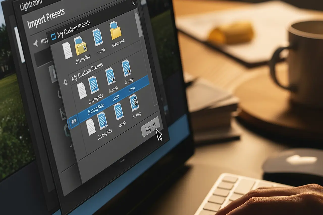
Import on a new system: double-click the `.zip` or via the Presets panel → "Import Presets". `.xmp` presets are fully compatible between Lightroom Classic, Cloud and Mobile.
07
Pitfalls
Common Mistakes and How to Avoid Them
Even experienced photographers fall into the same preset-building traps over and over. Here are the most common — and the fix in one sentence.
The seven most common beginner mistakes
1 · Overdoing it
Extreme values (+100 vibrance, −100 shadows) only work in exceptional cases. Fix: stay with moderate values between −50 and +50. Keep extremes for manual per-image tweaks.
2 · Too many settings in the preset
If the preset overrides everything, it's no longer flexible. Fix: focus on curve, HSL and Color Grading. Keep exposure and white balance individual.
3 · Testing only on one image type
What works on a portrait can ruin a landscape. Fix: at least ten different images in testing, with at least three different genres.
4 · Poor organization
Hundreds of unnamed presets in one group. Fix: consistent naming (`Style_Genre_Version`) and sensible grouping from day one.
5 · Saving exposure in the preset
Classic beginner mistake. Fix: actively deselect exposure and white balance in the save dialog.
6 · Sharpening in the look preset
Sharpening belongs in the import preset, not the look. Fix: build a separate sharpening preset that runs on import.
7 · Never cleaning up
Preset graveyard instead of library. Fix: quarterly review, archive the unused.
Technical issues — the quick fixes
Three failure modes come up most often for me. If you see one of them, those are the first places to check:
Preset isn't shown
Restart Lightroom. If that doesn't help: Preferences → Presets → "Show Lightroom Presets Folder" and check that the `.xmp` is in the right folder.
Preset looks completely different on other images
Most common cause: different Camera Raw profiles or a different white balance on the base image. Align both before judging.
Preset makes images too dark/light
Exposure is saved in the preset — re-save the preset and deactivate exposure in the process. Old versions can't be "detoxed" retroactively.
Quality control: the checklist before "done"
Before you consider a preset finalized, it should run through this checklist. When all boxes are ticked, it can move into the main library:
◆Works well on at least 80 % of the test images.
◆No over- or underexposure in critical areas.
◆Skin tones look natural (for portrait presets).
◆Colors aren't oversaturated or unrealistic.
◆Preset has a recognizable, consistent style.
◆Name and category are logical and consistently named.
◆Only the necessary settings are activated.
08
Practice
Five Preset Recipes to Build Directly
Theory is good, practice is better. Here are five proven preset recipes with concrete slider values. Build them, tweak them to taste — and you have the cornerstone of your own library.
Recipe 1 · Natural Portrait — the all-rounder
Perfect for natural portraits in daylight. A good starting point for beginners because it stays moderate and rarely tips images over.
Section
Setting
Highlights
−60
Shadows
+40
Whites
+20
Blacks
−15
Contrast
+15
Vibrance
+15
Tone curve
Slight S-curve · black point at 8
HSL orange luminance
+15 (radiant skin)
HSL aqua saturation
−25 (more natural eyes)
Color Grading highlights
Warm gold · hue 45° · saturation 8
Slider values for "Natural Portrait" — ideal for outdoor portraits, families, lifestyle.
Recipe 2 · Moody Landscape — dramatic landscapes
For atmospheric landscapes with a dramatic sky and rich colors. Works particularly well with clouds, rain, blue hour.
A classic film look inspired by Kodak Portra and Fuji Pro 400H. Works particularly well for street and travel.
Section
Setting
Highlights
−50
Shadows
+30
Whites
−20
Blacks
+35
Contrast
+5
Vibrance
−15
Saturation
+10
Tone curve
Film curve · black point at 20
HSL red saturation
+20
HSL yellow saturation
+15
HSL blue saturation
−20
Color Grading highlights
Warm orange · hue 35° · saturation 15
Color Grading shadows
Cool cyan · hue 180° · saturation 10
Slider values for "Vintage Film" — street, documentary, portrait, travel.
Recipe 5 · B&W Classic — a timeless black & white look
An elegant black and white look with classic film character. Works universally — from architecture to portrait.
Section
Setting
Treatment
Black & White
Highlights
−70
Shadows
+40
Whites
+30
Blacks
−20
Contrast
+25
Tone curve
Classic S-curve for drama
B&W mix red
+40 (bright skin tones)
B&W mix orange
+30
B&W mix yellow
+20
B&W mix blue
−30 (dramatic sky)
Color Grading highlights
Warm sepia · hue 45° · saturation 8
Color Grading shadows
Cool gray · hue 220° · saturation 5
Slider values for "B&W Classic" — portraits, street, architecture, fine art.
Editor's Choice
Adobe
Adobe Photography Plan (Lightroom Classic + Photoshop)
The software where presets are made
The **Creative Cloud Photography Plan** includes Lightroom Classic, Lightroom (Cloud), Photoshop and 20 GB of cloud storage. Custom presets are ideally built in **Lightroom Classic** — that's where you find the full Develop module with tone curve, HSL, Color Grading and AI masking.
Was überzeugt
+Full Develop module for preset development
+Presets sync between Classic, Cloud and Mobile
+Color Grading, AI masks and tone curve in one software
+Photoshop for fine retouching and compositing included
Was Du wissen solltest
−No one-time purchase — subscription ends with cancellation
−20 GB cloud storage is tight for pure cloud workflows
−Learning curve in Classic higher than in mobile apps
Editor's Statement
“My recommendation for preset development: Classic + Photoshop bundled”
Do `.xmp` presets work the same in Lightroom Classic, Cloud and Mobile?+
Essentially yes. Since the switch to the open `.xmp` format, presets sync via the Adobe cloud across all variants. However, some newer features — like Point Color, some AI mask options and generative AI tools — are only fully available in Lightroom Classic. Presets using these features either fall back to the next available setting or are partly ignored in the other versions. If you care about full compatibility, build your main library out of the classic tools (Basic, curve, HSL, Color Grading) and use AI masks per image instead.
Should I save exposure in the preset or not?+
No — except in rare exceptions. Exposure is too image-dependent to meaningfully sit inside a universal preset. If you save it anyway, you'll fight against the preset itself in 80 % of later applications. The exception: shooting-specific presets that you only use for a single specific image series (e.g., "Wedding Indoor 5500K"). Those can make sense because the lighting setup is essentially identical. For everything else: correct exposure and white balance individually per image before the preset click.
How many presets do I realistically need?+
Fewer than most people think. From over 15 years of practice: eight to fifteen well-maintained presets cover the majority of all real-world cases. If you work modularly (three to four base modules, four to six color modules, three to four tone curves), you get by with about 15 modules instead of 80 finished presets and are still more flexible. Larger collections are often a sign of poor cleanup discipline, not more creative possibilities.
Can I save AI masks (subject, sky) in presets?+
Since 2024 yes — with limitations. Lightroom Classic allows you to create adaptive presets with AI masks. On applying to a new image, Lightroom re-runs the mask detection (i.e., "find the subject in this image") and applies the saved adjustments to it. That works very reliably on clearly defined subjects (one person, one sky) but weakens on complex scenes with multiple possible subjects. For standard presets I recommend using AI masks per image rather than saving them in the preset.
Are expensive influencer preset packs worth it?+
Mostly not — at least not as permanently used tools. Bought preset packs are useful as learning material: you analyze how a particular look is built and use that as inspiration for your own variants. As a sole editing solution they're rarely ideal because they rarely match your camera, your light or your style. Anyone wanting to build a consistent visual style should eventually develop their own presets — if only because the time you invest in bought presets (analysis, adaptation, workarounds) is often longer than building your own.
Where are Lightroom presets stored?+
In Lightroom Classic you'll find your presets under Preferences → Presets → "Show Lightroom Develop Presets". On macOS they live in `~/Library/Application Support/Adobe/CameraRaw/Settings/`, on Windows in `%APPDATA%\Adobe\CameraRaw\Settings\`. Since Camera Raw and Lightroom Classic share the same location, your presets are automatically available in Photoshop (Camera Raw) too. Lightroom Cloud and Mobile sync via the Adobe cloud and have no directly accessible folder — but they're everywhere without you having to move anything manually.
From my workflow
35mm & 120mm film presets
Portra, Kodak Gold, Velvia, HP5 & more — ready-made XMP presets for Lightroom Classic and mobile.
This article contains affiliate links to Adobe. If you purchase through these links, I receive a small commission — at no extra cost to you. Thanks for your support!
◆ Newsletter
Stay in the loop.
Camera and photography news, honest gear tests and new articles — in your inbox. Infrequent but relevant. No spam, unsubscribe anytime.