
Corporate Branding Photography: Brand Imagery, Not One-Off Shots

How photos make your brand recognisable across website, LinkedIn and employer branding — as a system, not a one-off shoot.

Corporate branding photography — brand imagery and visual language for companies
Martin Kleinheinz
Author
Martin Kleinheinz
Business photographer · Hannover
Updated
July 30, 2026

A strong portrait is good. A recognisable brand is better. In my corporate briefings in Hannover I see the same pattern: LinkedIn headshot today, team day next year, a hero sometime — and nothing belongs together. Corporate branding photography means the opposite: lock mood, light, people imagery and asset types so website, social, recruiting and print show the same brand. If you're planning that as a production, it starts under Business Photography.

This article is Post 7 in the Business Photography cluster — the brand-system deep dive. Here: visual language, guidelines, asset library, customer vs. employer, stock/custom/hybrid, archive and briefing. Practice from briefings and on-site productions — including what goes wrong when rules and archive are missing. No invented ROI percentages.

What is not in here: set series and posing → Employee Portraits & Corporate Photos. Team-day prep → Prepare Employee Photos. Outfit → Clothing for Business Photos. LinkedIn specs → LinkedIn Profile Photo. Budget → What Does Business Photography Cost. Industry tone → Photographer for Law Firms, Photographer for Doctors.
00
Start

What corporate branding photography is (and isn't)

Corporate branding photography is the photographic side of your brand: recognisable people, spaces and moments — in a visual language that holds across months and channels. It answers not only "Who is that?" but "How does this company feel?". That's craft plus system: light, colour, distance, pose, retouch and delivery formats become rules — not chance.

My rule of thumb: a good photo sells the moment. Brand imagery sells recognisability. If you want both, you need guidelines — not just a shoot day.

Martin Kleinheinz, business photographer Hannover

What it isn't: a portrait workshop ("how do I hold my head"), not a law-firm or practice deep dive, and no guarantee that "better photos" automatically bring more leads or applications. Industry tone lives in Photographer for Law Firms and Photographer for Doctors. Here the focus stays: a brand system for companies that want to look consistent across multiple touchpoints.

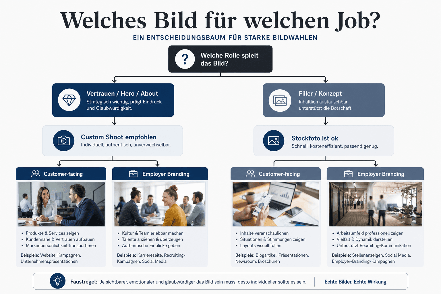
Decision tree corporate branding photography — purpose, channels, asset types, stock vs. custom, guidelines
From purpose through channels and asset types to guidelines, archive and briefing — the short path to a brand system instead of a one-off
For marketing & brand
You need visual language, asset matrix and guidelines (02–05), then stock/custom and archive (07–08).
For HR / employer branding
Separate customer and recruiting (04), then briefing and checklist (09, 11).
For leadership
Why logo alone isn't enough (01), typical mistakes (10), budget orientation via What Does Business Photography Cost.
01
Why

Why logo + CI colour aren't enough

Logo and CI colours are the entry — not the brand imagery. People recognise brands through faces, rooms, light mood and framing as much as through hex codes. A navy logo on the website and a cool studio portrait next to a warm stock hero feel like two companies. Photography is the part of the brand visitors feel before they read the claim.

In briefings I often hear: "We already have a styleguide." Then I open the website with the client: LinkedIn portraits from three different setups, a hero from a stock library, team photos from the company outing. The CI colour matches. The visual language doesn't. That's exactly where corporate branding photography begins — with which photographic language fits the brand, not which hex sits in the PDF.

In practice: if you only think "bigger logo", you don't build recognisability. If you lock light, distance, retouch and asset types, you do. The rest of this guide is for exactly that — and leads, when you want to produce, clearly to Business Photography.

02
System

Brand imagery as a system

A photo brand system has four levers: mood (how does the image feel?), consistency rules (what stays the same across shoots?), guidelines (what may agency and team decide themselves?) and asset library (which motifs exist, which are missing?). Missing one, the brand slips back into one-off mode.

Mood
Three to five adjectives often suffice: e.g. calm, bright, approachable, precise. Not ten buzzwords. Mood steers light, pose and retouch — and stops every project looking "somehow different".
Consistency rules
Same distance to the face, similar background treatment, matched colour temperature, retouch level. That's the difference between a series and a grab bag.
Guidelines
Short, visual, decision-ready — see section 05. Nobody reads long PDF novels on set.
Asset library
Hero, portraits, reportage, details — maintained, named, approved. Without an archive you buy the same problem every year. Typology follows in section 03.

In productions where mood and asset list are locked before set, the system scales: new hires get the same look, agencies know which crops are allowed, HR and marketing share the same pool — with clear usage limits. Without the library, the one-off reflex returns after six months. Next: which asset types you actually need.

03
Assets

Asset types: hero, portrait, reportage, detail

The system from section 02 needs building blocks. Without a typology you buy "photos"; with a typology you buy jobs. Four types cover most corporate needs — and stop every motif from having to do the same job.

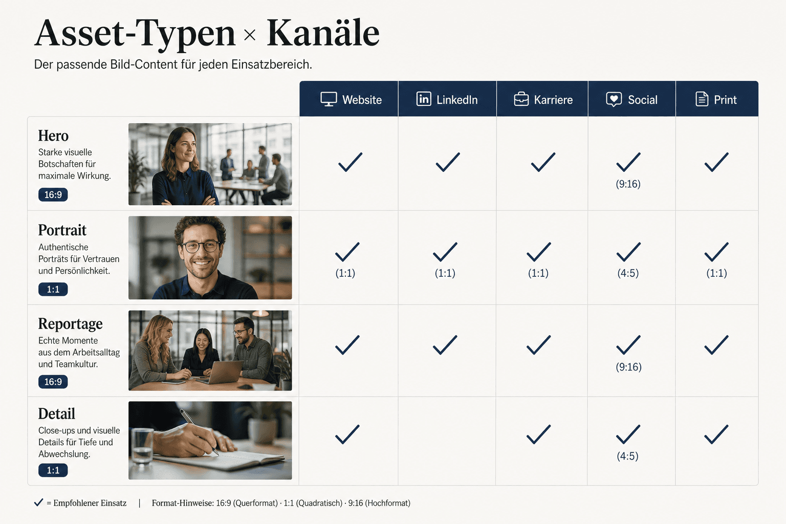
Asset matrix corporate branding — hero, portrait, reportage and detail by channel and purpose
Asset matrix: which type for which channel — hero carries landing pages, portraits faces, reportage culture, details credibility
TypeJobTypical channelsMistake if you misuse it
Hero / key visualFirst brand impression in 1–2 secondsWebsite home, campaigns, bannersToo generic or too portrait-close — feels like stock or a blown-up headshot
Portrait / headshotRecognisability and trustTeam page, LinkedIn, speaker, pressDifferent setups destroy the team series
Reportage / culture"How we really work"About, careers, social, pitch decksStaged "fake meetings" feel fake
Detail / environmentProduct, craft, space, materialWebsite modules, print, adsOnly details without people = brand without a face

Four asset types as a planning aid — not a rigid checklist for every company

For LinkedIn crops and circle formats: one strong portrait master beats five phone snaps. Specs and safe zones: LinkedIn Profile Photo. For the team page, consistency beats "every portrait especially creative" — see also the prep logic in Prepare Employee Photos.

04
Audiences

Customer-facing vs. employer branding

Same brand, two jobs. Customer-facing images sell offer and trust outward. Employer-branding images sell the workplace inward and to applicants. If you solve both with the same three stock laptops, neither feels credible.

Customer-facing
Clarity, competence, benefit. Portraits and spaces that fit the service — calmer for consultancies, often more precise for tech, more approachable for local providers. Industry tone: law firms, doctors.
Employer branding
Culture, team, everyday — without fake fun. Real work moments beat "everyone laughing at the camera". Careers pages need faces you'd recognise on day one.
Use the overlap
Many motifs serve both worlds — if guidelines allow both uses. Separate story and caption more than fully separate shoots, unless the brand worlds are deliberately different.

In briefings I often ask marketing and HR for two separate lists before the shoot: "What must the website carry this year?" and "What does careers/LinkedIn Company need?". That drives the asset matrix — not the gut feeling "we somehow need team photos". If both lists are missing, the same three motifs end up on sales and careers. Next: the rules that hold both worlds together.

05
Guidelines

Writing photo guidelines (mini template)

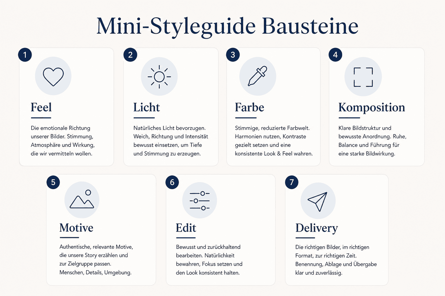
Good photo guidelines are a decision aid on set and in the agency — not a design bible. In practice nobody opens a 40-page PDF before the shoot; one page of core rules plus do/don't images, yes. I use the mini template below again and again in corporate briefings — as a shared checklist with marketing, HR and photographer, not as brand philosophy:

Photo styleguide building blocks — mood, light, distance, retouch, do/don't and delivery formats
Styleguide building blocks: mood and rules first, then do/don't and delivery formats — not logo watermarks as "branding"

Mini template (copyable)

  • ☐ Mood (3–5 adjectives) + 2 reference images "like this" / 2 "not like this"
  • ☐ Light: soft/hard, daylight/flash, background light/dark
  • ☐ Distance & crop: headroom, chest/hip cut, circle-ready?
  • ☐ Colour: temperature, saturation, CI colours in the room — not as filter override
  • ☐ Retouch: skin natural, no beauty smoothing; glasses reflections ok?
  • ☐ People: gaze, smile level, hands, diversity note without token pose
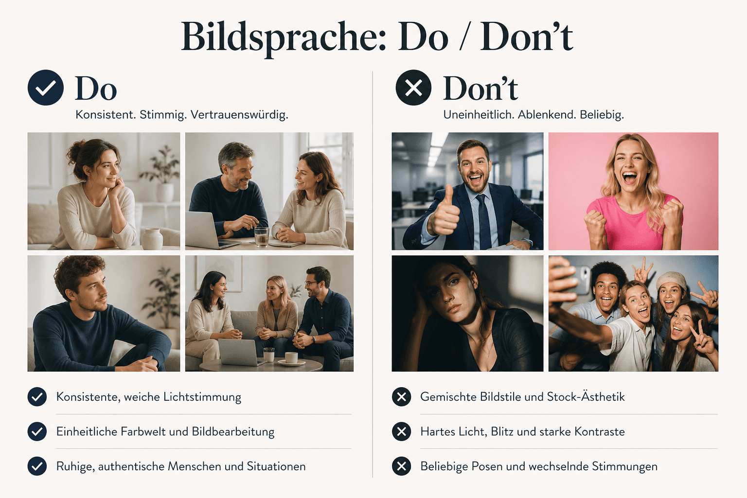
  • ☐ Do/don't: outfit (see clothing guide), backgrounds, props
  • ☐ Formats: master resolution, web crops, LinkedIn circle, print bleed
  • ☐ Rights & approval: who approves, where stored, naming convention
Visual language do and don't — consistent brand imagery vs. uneven one-off looks
Do/don't makes guidelines tangible: the same light and distance language beats "every motif differently creative"

Attach the do/don't page to every briefing — so reference and delivery formats land in the same document. In teams without that page, the look drifts as soon as a new agency or social intern crops. When GDPR, consent or image rights come up in the team: organisational care yes, legal interpretation no. Soft deep dive: GDPR for Photographersnot a substitute for your legal counsel.

Guidelines lock the look — CI decides how strongly brand colour and logo may play in the image. Without that step, "branded" slides fast into watermarks and filters.

06
CI

Match CI without logo kitsch

Matching CI means: choose a photographic language so logo, colour and typography fit with it — not slap a big logo in the frame and call it "branded". Watermarks, coloured gel overkill and "filter everything to Pantone" quickly feel like ad kitsch and age badly.

Steer colour through the environment
Walls, clothing, props near CI — subtle. A navy blazer on calm grey beats a neon-filtered portrait with a logo in the corner.
Contrast and white space
Brands with lots of white space often need brighter, calmer images. Dark premium brands tolerate more shadow — as long as faces stay readable.
Retouch to tone of voice
Tech-clear vs. craft-warm: bake retouch and sharpness in. Consistent across the series — not person A "magazine", person B "passport photo".
Logo only where it makes sense
On glass, products, tools — as reality in the room. Not as a stamp on every face.

If the brand needs to be stricter or warmer by industry, the system logic stays the same — the tone changes. For that, the deep dives Photographer for Law Firms and Photographer for Doctors; here the general corporate frame stays. Next: which motifs you buy and which you produce yourself.

07
Sourcing

Stock, custom or hybrid

Look and CI are settled — now sourcing. The honest answer: almost nobody builds everything custom, and almost nobody survives long-term on stock alone when faces and culture matter. The decision is strategic, not moral.

ApproachWhen it makes senseStrengthLimit
StockEarly website, abstract topics, budget squeezeFast, cheap, licence-clear (with a clean licence)Faces feel interchangeable; culture isn't "yours"
CustomTeam, founders, real spaces, employer brandingRecognition, control, series possibleTime, coordination, investment — see pricing guide
HybridMost SMEs and scale-upsOwn faces + stock for metaphors/detailsNeeds guidelines, or the worlds drift

Stock, custom, hybrid — decide by the motif's job, not the gut feel "stock is cheap"

Hybrid works when custom carries the identity-close assets (portraits, office, core hero) and stock the abstract ones (illustration themes, icon-like, generic metaphors). As soon as stock people land on the team page, trust breaks. Budget orientation for custom: What Does Business Photography Cost. What you've produced has to stay findable afterwards — or the shoot was a one-off.

08
Archive

Image archive instead of one-off

The most expensive corporate shoot is the one you can't find in two years. In handovers after productions I often see: nice masters — but no naming convention, no approval status, HR and marketing with different folders. An image archive isn't a Dropbox box: metadata (person, date, rights, channel), one source of truth and clear crops from the master.

Master + crops
Keep high-res masters; derive web and social crops. LinkedIn circle from the master: LinkedIn Profile Photo.
Freshness cycle
Review portraits every 2–3 years; sooner with visible changes. Renew reportage and hero after rebrand or move — or the series drifts quietly.
Onboarding handoff
Photograph new hires in the same look — not "quickly on the phone". Without that handoff the library breaks after the next hire. Prep: Prepare Employee Photos.
Document rights
Who may appear where? Soft: Model & Property Release — templates and organisation, not legal advice.

Anyone who names and approves the archive after the shoot saves the "emergency shoot before the trade fair". Anyone who only stores ZIP files buys chaos again. For production and archive to fit, you need a clear briefing — not just "we need team photos".

09
Briefing

Briefing the photographer

A good briefing saves half production days — I notice it on set when must-assets and crops are set beforehand. Send purpose, channels, asset types, mood, do/don't, headcount, location constraints and delivery formats: the building blocks from sections 03–08 in one email. The clearer, the less reshoot and the easier everything lands in the archive later.

  • Purpose & audiences (customer / employer / both)
  • Channels and crops (web, LinkedIn, print, ads)
  • Asset list prioritised (must / nice / later)
  • Mood + 4 reference images (2 do / 2 don't)
  • CI document or short guidelines (section 05)
  • Outfit rules — or link to the clothing guide
  • Schedule, one contact person, approval workflow
  • Rights: usage duration, media, images of third parties
  • Discretion: screens, client data, no-go zones on set
  • Archive handoff: naming convention, folders, who maintains the source of truth

On set, one contact person counts. Too many "tastes" destroy the series — that applies to light distance as much as "one more different smile". You don't brief technical kit as a shopping list — you brief the result. Body deep dive: Camera for Business Photographers; here it's enough: same light language across all people.

10
Pitfalls

Typical mistakes

One-off without guidelines
One day, many nice images — next year a different look. Brand drifts.
Expecting one motif to do everything
One portrait as hero, ads and culture story. Separate asset types.
Mixing customer and employer
High-gloss sales look on the careers page feels fake — and vice versa.
Stock faces as "team"
Instantly recognisable. Trust gone.
Logo kitsch
Watermarks and colour filters don't replace visual language.
No archive
Files lost, rights unclear, crops missing — launch stress pre-programmed.
Uneven hierarchy quality
CEO in the studio, rest on phone. Feels unfinished — see also team series in Employee Portraits & Corporate Photos.
ROI fairy tales in the briefing
"The shoot brings 35% more applications" without a source helps no one — nor do invented certificates. Consistency and clarity are the honest goals; Lucidpress 33% (2019) applies only to overall brand consistency, self-reported.

The good news: almost all mistakes are organisational. Less "better camera", more system. That's exactly why this post sits in the cluster before the pure tech deep dives — start: Camera for Business Photographers.

11
Close

Takeaway: brand imagery instead of one-off shots

Corporate branding photography isn't a single "nice" image. From briefings and on-site productions: mood, short guidelines, asset types and archive — so website, LinkedIn and employer branding show the same brand. Logo and CI colour remain necessary; without photographic language they aren't enough. Lucidpress 33% (2019) is not photo ROI — only a signal that consistency overall is taken seriously.

Start with purpose and asset matrix (03–04), write short guidelines (05), match CI without logo kitsch (06), decide stock/custom/hybrid honestly (07), brief clearly (09) — and maintain the archive (08). Industry tone: Photographer for Law Firms, Photographer for Doctors. Budget: What Does Business Photography Cost.
Checklist: before the branding shoot

  • ☐ Purpose: customer / employer / both defined
  • ☐ Channels and crops prioritised (web, LinkedIn, print)
  • ☐ Asset list: hero, portrait, reportage, detail
  • ☐ Mood + do/don't references (at least 2/2)
  • ☐ Photo guidelines mini template filled (section 05)
  • ☐ Stock/custom/hybrid decided
  • ☐ Outfit rules communicated — clothing
  • ☐ Prep plan for people & location — Prepare Employee Photos

Checklist: after delivery

  • ☐ Master + crops filed, named, approved
  • ☐ Old uneven assets on web/social replaced
  • ☐ Rights and consents documented (internal / counsel)
  • ☐ Onboarding process for new portraits defined
  • ☐ Next freshness check scheduled (e.g. 24 months)
  • ☐ Budget reconciliation vs. pricing guide

If you're planning a brand system for portraits, team and corporate assets in Hannover next: enquire about business photography. Further reading: What Does Business Photography Cost, Prepare Employee Photos, Clothing for Business Photos. Tech trilogy (body): Camera for Business Photographers.

12
FAQ

FAQ on corporate branding photography

What sets corporate branding photography apart from regular business photos?
The system claim: mood, guidelines, asset types and archive — not just one successful single motif. Business photos can be part of it; branding photography thinks channels and recognisability from the start.
Is our logo styleguide enough?
For colour and type often yes — for photography rarely. You need rules for light, distance, retouch and do/don't. Otherwise every shoot drifts. See sections 01 and 05.
Is it true that brand consistency brings 33% more revenue?
The often-cited up to 33% figure comes from the Lucidpress State of Brand Consistency Report (2019) and is self-reported for overall brand consistency (logo, tone, templates, content) — not photography alone, not causal photo ROI, not a current guarantee for your shoot. No invented conversion, application or certificate claims here.
Stock or own shoot?
Hybrid is the pragmatic path for many SMEs: own faces and spaces custom, abstract motifs stock if needed — with guidelines so the worlds fit. Details in section 07.
Separate customer and employer images?
At least in the story: what sells the service, what sells the workplace? Motifs may overlap when rights and look fit — fake culture on the sales page and sales high-gloss on careers both feel wrong.
How long should photo guidelines be?
Short enough for 10–15 minutes. Mood, light, crop, retouch, do/don't, formats, rights. Long PDFs get ignored; a visual do/don't page gets used.
What about GDPR and model releases?
Organisationally relevant — especially with recognisable people and locations. Soft links: GDPR for Photographers, Model & Property Release. Not legal advice; for binding questions use your counsel.
What does a corporate production cost?
Depends on people, asset types, retouch and usage rights — orientation, not a fixed price list here. Details: What Does Business Photography Cost.
Do you offer corporate branding photography in Hannover?
Yes. I'm a business photographer in Hannover — brand system for portraits, team and corporate assets. Enquiry: Business Photography. Open: I earn from bookings; the guide stays usable without a booking.
**Disclosure:** I'm a business photographer in Hannover and offer [business photography](/en/business-photography/) myself — portraits, team series and corporate images for brand imagery and employer branding. Openly disclosed; you don't need a booking to use the guide. No invented conversion/application ROI figures and no invented certificates. The Lucidpress/Marq figure on brand consistency (**2019**, up to 33%) is self-reported for **overall** brand consistency — not photography alone; see section 01. Legal keywords (GDPR, consent, model release) are organisational practice, **not** legal advice. As of: July 2026.
Next step

Brand imagery settled — and produced professionally?

I'm a business photographer in Hannover: corporate series with clear visual language, asset types for website, LinkedIn and employer branding, guidelines and crops from one setup. Write me purpose, channels and asset list. Open: I earn from the booking; the guide above stays the practice standard for brand system over one-off — even without a booking.

Keep reading

From the journal.

Fotograf, Martin Fernando Mera Kleinheinz · Franz-Bork-Straße 21, 30163 Hannover · 0179 4085297