Photo Editing for Photographers: The Complete 2026 Guide
Learn professional photo editing from the basics to advanced techniques. RAW editing, Lightroom, Photoshop and more — explained clearly for beginners.
Author
Martin Kleinheinz
Photographer · Hannover
Updated
May 25, 2026
Welcome to the world of photography! You've pressed the shutter and captured a special moment. But now what? Many beginners believe a good photo has to be perfect straight out of the camera. The truth, however, is that the shot is only half the battle. Photo editing is not "cheating" or correcting mistakes — it's the second, equally creative part of the photographic process. Think of it as the modern, digital darkroom. Photographers used to spend hours in the lab developing negatives and perfecting prints. Today we do the same — just on the computer.
Especially if you shoot in RAW, the "digital negative", you're holding pure, unprocessed sensor data. These files often look flat, low in contrast and unimpressive, which can surprise beginners. That's not a flaw, however — it's by design. This format preserves the maximum amount of image information and gives you full control to bring your creative vision to life. The vivid, punchy images you admire from professionals are almost without exception the result of thoughtful post-processing. The camera captures the scene, but only through editing do you capture the feeling of the moment and turn a good image into a great one.
01
Introduction
Why Edit Photos? Goals and Possibilities
The role of editing in photography
As a beginner, the world of photo editing can seem overwhelming, with all its sliders, curves and tools. But don't worry: the journey starts with small, achievable steps. Your goals in editing fall into three areas:
Goals and possibilities for beginners
Basic corrections
First it's about making the image technically clean. You learn to adjust exposure so no details are lost in the bright or dark areas. You correct color casts so colors look natural and optimise contrast so your image doesn't look flat. This is the foundation for displaying a photo the way you remember the scene.
Creative development
Once the basics are in place, the real fun begins. Here you develop your own recognisable style. Do you dream of light, airy portraits? Of dramatic, high-contrast landscapes? Or atmospheric black-and-white shots that stir emotion? Editing gives you the tools to create these looks and put your personal handwriting on your photos.
Technical perfection
The final step is preparing your image for the world. You learn to remove distracting elements such as small spots or distracting objects, apply sharpening with intent and export your photo optimally for various purposes — whether a razor-sharp print on the wall or a glowing appearance on Instagram. For professional photo delivery, the right export settings are crucial.
02
Basics
The Key Basics of Editing
Before you move a single slider, it's crucial to understand some technical basics. These decisions, which you often already make in the camera, lay the groundwork for your entire editing process and determine the possibilities available later.
File formats (JPEG, RAW, PNG & Co.)
Every file format has its purpose and quirks. Choosing the right format in the camera or on export significantly influences what you can do with your image. You'll find a detailed comparison in the guide Which image format is best?.
RAW — the digital negative
Think of RAW as the undeveloped "negatives" of digital photography. These files contain all the original sensor data, without the camera performing any irreversible processing. Every adjustment you make in editing is stored separately and never alters the original data. That means you can return to the unedited original at any time or change your edits without quality loss. Advantages: maximum flexibility in editing, lossless adjustments, best image quality, large reserves for exposure compensation. Important for professional photo delivery. Disadvantages: large files, require special software to edit, often look flat and low in contrast straight from the camera.
JPEG — the universal format
This is the universal image format readable by almost every device on the planet. When your camera creates a JPEG it takes the RAW data and applies editing internally (sharpening, contrast, saturation). To reduce file size, it uses a "lossy" compression in which image information is irretrievably discarded. Advantages: files are small, share quickly and look good straight from the camera. Ideal for quick snapshots, social media or when storage is scarce. Disadvantages: the editing latitude is severely limited. Every time you edit and re-save a JPEG it loses more quality.
PNG — lossless quality
This format uses "lossless" compression, meaning no image quality is lost when saving. Main advantage: PNG supports transparent backgrounds, making it the first choice for logos, watermarks or graphics you want to overlay on other images without a visible white box. Disadvantages: files are usually larger than JPEGs and less suited to complex, colorful photographs.
WebP — the modern web format
WebP is Google's modern image format, developed specifically for the web. It combines the strengths of JPEG and PNG in one format: small file sizes with high quality and support for transparency. Advantages: significantly smaller files than JPEG at the same quality, transparency support like PNG, perfect for websites and social media. Modern browsers fully support WebP. Disadvantages: older browsers and devices may not support WebP. For maximum compatibility you should always keep a JPEG fallback ready.
Resolution, crop and aspect ratio
These three terms describe the geometry of your image and are decisive for composition and later use.
◆Resolution: the number of pixels making up your image, given as width by height (e.g. 6000 × 4000 pixels). Higher resolution captures more detail and allows larger prints or heavier zooming without quality loss.
◆Aspect ratio 3:2: the standard for most mirrorless and DSLR cameras, derived from the classic 35 mm film format. More on sensor sizes and cameras.
◆Aspect ratio 4:3: typical for Micro Four Thirds cameras and many smartphones.
◆Aspect ratio 16:9: a wide, cinematic format perfect for sweeping landscapes or display on modern screens.
◆Aspect ratio 1:1: the square format popularised by platforms like Instagram.
◆Cropping: the tool with which you change the framing in post-processing. You can remove distracting elements at the edge, improve composition or fit the image to a specific aspect ratio.
Color spaces: What is RGB?
A color space is essentially the "language" a device uses to describe colors. For digital photography two are particularly important, both based on the RGB (Red, Green, Blue) model.
◆sRGB: the universal standard color space for the internet, most monitors and smartphones. If you want your images to look as similar as possible on every screen, sRGB is the right choice. It's the "world language" of digital color.
◆Adobe RGB: larger than sRGB and able to reproduce notably more saturated greens and blues. It was developed to close the gap between the colors of a monitor (RGB) and those of a high-quality printer (CMYK). If you want to print professionally and your print lab supports it, Adobe RGB can deliver more vivid results.
You can convert an image from a large color space (Adobe RGB) into a smaller one (sRGB) without issues. The reverse doesn't work, however, because the additional color information is missing from the sRGB file in the first place.
◆ Lightroom PresetsBundle
Photos with film character
9 Lightroom presets inspired by Portra, Kodak, Fuji & Ilford — for street, portrait and landscape. One-time €29, no subscription.
Choosing the right software is like picking the right tool from a toolbox. Each program has its strengths and is better suited to certain tasks. For beginners, three names are particularly relevant: Lightroom, Photoshop and Luminar. Modern editing is no longer an either/or question; it's often about building an ecosystem of tools that work together.
The best programs at a glance
Adobe Lightroom & Lightroom Classic
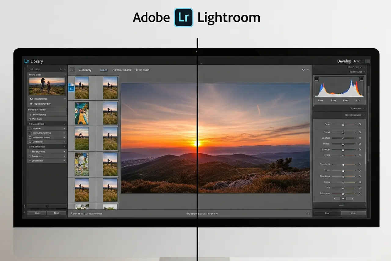
Lightroom is the Swiss army knife for photographers and the hub for most of your workflow. More in the guide What is Lightroom?. Lightroom Classic is the desktop-based version and the industry standard for professional photographers. Your photos are stored locally; it offers extremely powerful organisational tools and deep, non-destructive editing. Lightroom (Cloud) is the modern cloud-based variant. Your originals are stored in Adobe's cloud and synced automatically between desktop, tablet and smartphone. The interface is considerably simpler and more intuitive — a perfect entry point for beginners.
Adobe Photoshop
While Lightroom handles the entire workflow for 99 % of your images, Photoshop is the specialist for the remaining 1 %. It's not a program for managing image libraries but a tool for pixel-level manipulation of individual images. Strengths: working with layers lets you combine multiple images into a composite, perform complex retouching, remove large distracting objects seamlessly or add text and graphics. When to use it? You switch from Lightroom to Photoshop when you have a task Lightroom can't handle — e.g. replacing a boring sky or removing a person from a group photo.
Skylum Luminar Neo
Luminar Neo is a standalone image editor that has made a name for itself with impressive AI-powered tools. Strengths: with Sky AI you can swap the sky in a few clicks, Enhance AI optimises your image with a single slider, and tools like Portrait Bokeh AI or GenErase enable professional-looking effects without the steep learning curve of Photoshop. Luminar can be used as a standalone program or as a plugin within Lightroom or Photoshop. Who is it for? Perfect for hobby photographers, especially in landscape and portrait, who want to get the maximum out of their images without a lot of effort.
Feature
Lightroom Classic
Lightroom (Cloud)
Photoshop
Luminar Neo
Main purpose
Organising & editing large image volumes (workflow hub)
Editing & syncing across devices
Detailed image manipulation & compositing
Fast AI-driven editing & effects
File storage
Local (hard drive)
Cloud-based
Per individual file (local)
Local (catalog)
Learning curve
Medium
Low
High
Low to medium
Ideal for beginners
Yes, as a comprehensive tool
Excellent, easy entry
More for advanced users
Excellent, for fast results
Strengths
Cataloguing, batch processing, print module
Simplicity, mobility, automatic backups
Layers, masks, retouching, creative freedom
AI tools (sky, portrait), presets, extensions
Comparison of the main photo-editing programs for photographers
04
Workflow
Core Editing Steps
Every edit follows a logical sequence. If you follow these steps from "global" to "local" and from "basic" to "fine", you'll work more efficiently and achieve better, more consistent results. Picture it like building a house: you start with the foundation before you paint the walls.
Cropping and straightening
This is often the very first step of your editing process. Before you worry about colors and exposure, make sure your composition and orientation are correct.
◆Straightening: nothing looks less professional than a tilted horizon, especially in landscapes or architecture. Almost every program offers a tool to straighten the image. In Lightroom it's in the Crop tool (keyboard shortcut 'R').
◆Cropping: use the crop to strengthen the image's statement. Remove distracting elements at the edge that pull attention from the main subject. A tighter crop can put more focus on your subject, or you can improve composition by placing the subject along the lines of the rule of thirds.
Adjusting exposure and brightness
This is the foundation of your edit. Here you ensure the image is neither too bright ("blown out") nor too dark ("crushed") and that all important details remain. The histogram is your best friend here — it graphically shows the distribution of tonal values and warns you when areas turn completely white or black without detail. More in the guide on exposure compensation.
◆Exposure: controls the overall brightness of the image. A small adjustment here can make a big difference.
◆Highlights: this slider is a lifesaver for overexposed areas. It can recover detail in very bright sections, like clouds in an otherwise correctly exposed sky.
◆Shadows: the counterpart to highlights. This slider brightens the darkest parts of your image and reveals detail hidden in shadow.
◆Whites & Blacks: these two sliders define the brightest and darkest point in your image. By setting the white point and defining the black point, you give your image a full tonal range and increase global contrast.
Optimising contrast and color balance
Once basic brightness is right, the next step is giving the image more "punch" and the right colors.
◆Contrast: raises the difference between bright and dark tones. A bit more contrast immediately makes an image look stronger and less flat. Move carefully, though — too much contrast can quickly destroy detail in highlights and shadows.
◆White balance: corrects color casts. With the sliders Temperature (shifts colors along the blue-yellow axis) and Tint (shifts along the green-magenta axis), you ensure white objects actually look white and skin tones look natural.
Sharpness, clarity and noise
These final steps in basic editing give your image its final polish and ensure a clean, detailed rendering.
◆Clarity: a very popular slider that boosts contrast specifically in the midtones. It makes textures and edges appear more defined and adds drama and depth to the image.
◆Texture: finer than "Clarity". This slider emphasises or reduces the finest surface structures in the image. Ideal for influencing the texture of fabrics or skin pores, for example.
◆Sharpening: every digital image benefits from a touch of sharpening. But this should be subtle and often one of the last steps.
◆Noise reduction: if you shot in low light with a high ISO, digital noise often appears. Use the noise reduction sliders to smooth it out for a cleaner image.
05
Creativity
Designing Colors and Looks
Once the technical basics are in place, the creative part of color design begins. Here you give your photo a specific mood and develop your personal style. This process splits into two phases: first the correction for a neutral, realistic base, then the creative design for the desired look.
Understanding and using white balance
White balance is the foundation of any color correction. Its goal is to neutralise color casts caused by different light sources. Our brain corrects these casts automatically, but a camera records them mercilessly. Candlelight creates a warm, yellowish tone (around 2000 Kelvin), while light in shade is cool and bluish (around 7500 Kelvin). White balance ensures a white sheet of paper actually appears white in the photo — not yellowish or bluish.
In Lightroom you have two easy methods for correction:
◆The eyedropper: select the eyedropper tool in the Basic panel and click on a spot in the image that should be neutral grey or white. Lightroom then automatically adjusts Temperature and Tint.
◆Manual sliders: move the sliders for Temperature (blue ↔ yellow) and Tint (green ↔ magenta) until colors look natural.
Once colors are neutral, you can also use white balance creatively: give a sunset extra warmth or a winter landscape a cool, blue mood to reinforce the feel of the scene.
Saturation, vibrance and color correction
These three tools give you control over the intensity and character of the colors in your image.
◆Saturation: boosts the intensity of all colors in the image equally. It's a powerful but also dangerous tool. Too much saturation quickly leads to screaming, unnatural colors and especially makes skin tones look blotchy or orange — a classic beginner mistake.
◆Vibrance: the "smarter" saturation slider. It mainly affects less saturated colors and largely leaves already vivid colors untouched. Particularly important: it protects skin tones (reds and oranges) from unnatural oversaturation.
◆Color correction (HSL/Color Panel): here lies the real power of creative color design. HSL stands for Hue, Saturation and Luminance. In this panel you can adjust each color group (red, orange, yellow, green, aqua, blue, purple, magenta) individually. You can, for example, make just the blue tones in the sky stronger without affecting skin tones.
Black-and-white conversion
A black-and-white image is more than a color photo without color. It's a reduction to the essentials: shapes, textures, contrast, light and shadow. A good conversion is a creative process.
◆The first click: the easiest way in Lightroom is to click "Black & White" in the Basic panel. Alternatively, choose a B&W profile in the Profile Browser, which often gives you a better starting point (e.g. "B&W High Contrast").
◆The B&W Mixer: after converting the image, the HSL/Color panel turns into the Black & White Mixer. With the sliders (red, orange, yellow etc.) you control how bright or dark the grey tones based on the original colors appear. Want a dramatic, dark sky? Drag the blue slider to the left.
◆The Targeted Adjustment Tool: instead of guessing the sliders, activate the small target icon in the Mixer panel, click directly on an area of the image (e.g. the sky) and drag the mouse up (brighten) or down (darken).
06
Advanced
Powerful Adjustments for Better Images
Once the basics of your image are in place, you can add the finishing touches with targeted effects and corrections. Here it's about applying creative looks or fixing technical shortcomings. The key to success is using these tools deliberately and subtly.
Using filters and presets purposefully
Presets (or filters) are saved editing settings you can apply to your photo with a single click. They are extremely popular and can be a powerful tool in your arsenal if used correctly.
◆What presets do: they can save you a lot of time, especially when editing a series of photos in a consistent style (so-called "batch editing"). They are also a fantastic learning tool: apply a preset and look at which sliders have changed.
◆How to use them correctly: the biggest mistake is to treat a preset as the final solution. A preset is a starting point, not the destination. Every photo is unique in terms of light and exposure. After applying a preset you almost always need to fine-tune basic adjustments.
Skin retouching (carefully!)
On portraits, subtle skin retouching can be the difference between a snapshot and a professional image. The goal is always a natural improvement, not artificial "plastic skin". For professional portrait photography a consent form is important.
◆Removing individual distractions: for pimples, small scars or blemishes the Healing tool (often called the "Healing Brush") in Lightroom is your first choice. You simply click on the distraction and the program intelligently replaces it with a clean skin texture.
◆Softening skin: to make skin look slightly softer and smoother overall without losing texture, use a mask in Lightroom. With the Brush tool, paint over the skin areas and then in the mask settings reduce the Texture and/or Clarity sliders slightly. A small reduction in texture smooths the skin but preserves pore structure for a natural result.
Red-eye correction
The classic problem with photos taken with direct flash: pupils glow red. Fortunately this is one of the easiest issues to fix.
◆The right tool: in Lightroom's Develop module you'll find a dedicated Red-Eye Correction tool.
◆Humans and animals: the tool offers two modes: "Red Eye" for people and "Pet Eye" for the greenish or yellowish glow that can appear in animals.
◆Easy to use: select the tool, click in the middle of the pupil and drag out a circle that covers the entire red area. Lightroom does the rest. You can adjust the size of the area and the darkness of the correction if needed.
Removing small distractions (spots, sensor dust)
Sometimes small but distracting elements sneak into the image: a dust grain on the lens or a sensor spot that appears as a dark, blurry dot, especially on bright single-color surfaces like the sky.
◆The tool of choice: here too the Healing tool (keyboard shortcut 'Q' in Lightroom) is perfect.
◆The trick to finding spots: often these spots are tiny and barely visible. This is where the brilliant "Visualise Spots" function comes in. When you activate the option (key 'A'), your image is shown in a high-contrast black-and-white view in which even the smallest spot jumps out.
◆The fix: once you've found the culprits, simply click on them with the healing brush. Lightroom automatically picks a clean nearby area to cover the spot. You can move the source area manually if needed.
Lightroom Presets9 film looks inspired by Portra, Kodak & Fuji —View pack →
07
Quality control
Tips for a Natural Look
One of the biggest goals in editing is to improve a photo without the editing itself taking centre stage. A natural-looking image feels authentic and draws the viewer into the scene. The key lies in restraint and the ability to evaluate your own adjustments objectively. In event photography this natural look is especially important.
Avoiding over-processing
The most common giveaway of a beginner's edit is exaggeration. When colors scream, skin looks like plastic or edges are unnaturally sharp, you've meant too well. This phenomenon often arises through visual desensitisation: while you work on an image, your eyes get used to ever stronger adjustments.
Typical signs of over-processing include:
◆Oversaturated colors: especially skin tones that look unnaturally orange or red are a clear warning sign.
◆Exaggerated sharpness and clarity: this leads to ugly glowing seams (halos) at the edges of objects and makes portraits look harsh and unflattering.
◆Too strong vignettes: when darkened corners are perceived as clear black borders, they distract rather than subtly drawing the eye to the centre.
◆Loss of detail: too much contrast or shadows pushed too far can cause detail in the brightest and darkest areas to disappear completely ("clipping").
Before-and-after comparisons
Your most important tool for self-control while editing is the direct comparison with the original. It's the technical counterpart to visual adjustment and helps you stay grounded.
◆Quick toggle: in Lightroom a single press of the backslash key (\) switches between the unedited and the edited version. This quick toggle instantly reveals how far you've moved from the original.
◆Side-by-side view: the 'Y' key activates a split view that places the original and your edit directly next to each other. Ideal for objectively judging subtle changes in color and contrast.
Use these features regularly during your workflow. They're the compass that ensures you improve the original intent of your photo and don't get lost in the endless possibilities of the sliders.
08
Export
Saving and Exporting Done Right
You've finished editing your image — congratulations! The final step is to save it from your editing software in a finished file format. This process is called "exporting". It's really a translation process: you translate your high-resolution working file into a specific "language" (file format, size, color space) understandable by a specific "audience" (a website, a printer, a social media feed). For video editing, similar principles apply.
The right settings for web, social media and print
The requirements for an image shared on Instagram are fundamentally different from those for a large-format print. Here are the most important settings for the two most common use cases:
For web & social media (Instagram, Facebook, blog, etc.): the goal here is good image quality at the smallest possible file size for fast load times.
◆File format: always JPEG. It offers the best compression for online use.
◆Color space: absolutely sRGB. This is the universal standard for all web browsers and mobile devices. Using a different color space leads to incorrect, dull colors on most screens.
◆Quality: a value between 80 and 90 on the JPEG quality scale is an excellent compromise between image quality and file size.
◆Image size (dimensions): scale the image down to the platform's recommended dimensions. For Instagram a long edge of 1080 px — or 2048 px for higher quality — is a good guide.
◆Output sharpening: enable "Sharpen For" and select "Screen" with strength "Standard" or "High".
For high-quality printing: here the goal is maximum image quality; file size is secondary.
◆File format:TIFF (in 16-bit) is the best choice for maximum quality. If your print lab doesn't accept TIFF, export as JPEG at the highest quality (100).
◆Color space: clarify this with your print lab! If unsure, sRGB is always the safe choice.
◆Resolution: the industry standard for sharp prints is 300 ppi (pixels per inch).
◆Image size (dimensions): export the image at the full resolution of your camera. The print lab can scale the image best for the desired print size.
◆Output sharpening: enable "Sharpen For" and choose the paper type — i.e. "Matte Paper" or "Glossy Paper".
Dealing with quality loss
The main reason for quality loss is the "lossy" compression of the JPEG format. Every time a JPEG is compressed, image information is irretrievably discarded to reduce file size.
To minimise this, remember a simple principle: always edit your original file (ideally a RAW) and export the JPEG only once as a final step for the specific application. Never open an already exported JPEG, edit it and save it again as a JPEG. This process leads to a gradual degradation known as "generation loss". When publishing photos you should also consider the legal aspects.
09
Mistakes & solutions
Typical Mistakes and How to Avoid Them
Every beginner makes mistakes — that's a normal and important part of the learning process. The good news: in modern editing, almost all mistakes are reversible. If you know the most common pitfalls and understand your software's "rescue tools", you can experiment fearlessly. For professional photographers it's important to calculate the right hourly rate so editing time is included.
Common beginner mistakes (e.g. heavy filters)
Most mistakes come from excessive enthusiasm and the desire to "improve" an image at all costs. Here are the classics:
Oversaturation
The Saturation slider is pushed to the maximum. The result is screaming, unnatural colors and often glaringly orange skin tones. Avoidance: use the Vibrance slider instead, which protects skin tones, and adjust colors selectively in the HSL panel.
Excess contrast
Too much contrast makes all detail in shadows (black areas) and highlights (white areas) disappear. The image looks hard and flat. Avoidance: work subtly with the Contrast slider and use the Highlights, Shadows, Whites and Blacks sliders for more targeted adjustment.
Excessive sharpening
In the hope of a "crisp" image, the Sharpening slider is overused. This creates ugly white seams (halos) at edges and amplifies image noise. Avoidance: sharpen subtly and as one of the last steps. Zoom to 100 % to check the effect.
"Plastic skin"
In portrait retouching the skin is smoothed so heavily that every natural texture is lost. Avoidance: reduce the Texture slider only minimally and spare the eyes, lips and hair when editing.
Gimmicky effects
Effects like "selective color" (part of the image is in color, the rest in black and white) may once have been modern but today look mostly dated and amateurish. Avoidance: focus on strong composition and good lighting rather than gimmicks.
Correction and undo functions
The fear of "ruining" a precious photo with a wrong click is one of the biggest hurdles for beginners. Modern programs like Lightroom take that fear away completely, because they work non-destructively. This is perhaps the most important concept you need to understand.
Non-destructive editing
Your original file (RAW or JPEG) is never altered when editing in Lightroom. All your adjustments — every single slider you move — are stored only as a list of instructions in the Lightroom catalog file. You can return to the original at any time.
The History panel
Your ultimate safety net. It logs every single editing step you've made from the beginning. If you feel you've gone too far, simply click an earlier step in the list and your image jumps back to that exact state.
Snapshots
If you're particularly happy with a certain version of your edit, you can create a "snapshot". This saves the current state under a name you choose and lets you easily compare different editing variants (e.g. a color and a black-and-white version) later.
The classic "Undo"
Of course the universal keyboard shortcut Ctrl+Z (Windows) or Cmd+Z (Mac) also works to undo the most recent step.
These tools give you the freedom to experiment without fear. Try bold adjustments, see what happens, and if you don't like it, just step back. That's the best way to learn and find your own style.
10
Practice
Practical Exercise: Step-by-Step Editing
Theory is good, but you learn best through practice. In this section we walk you through editing four typical photo scenarios step by step. The key is to understand that each genre has different editing goals. It's not about moving the same sliders every time — it's about learning how an editor thinks for the subject at hand.
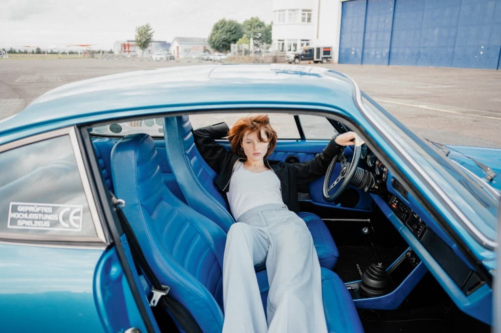
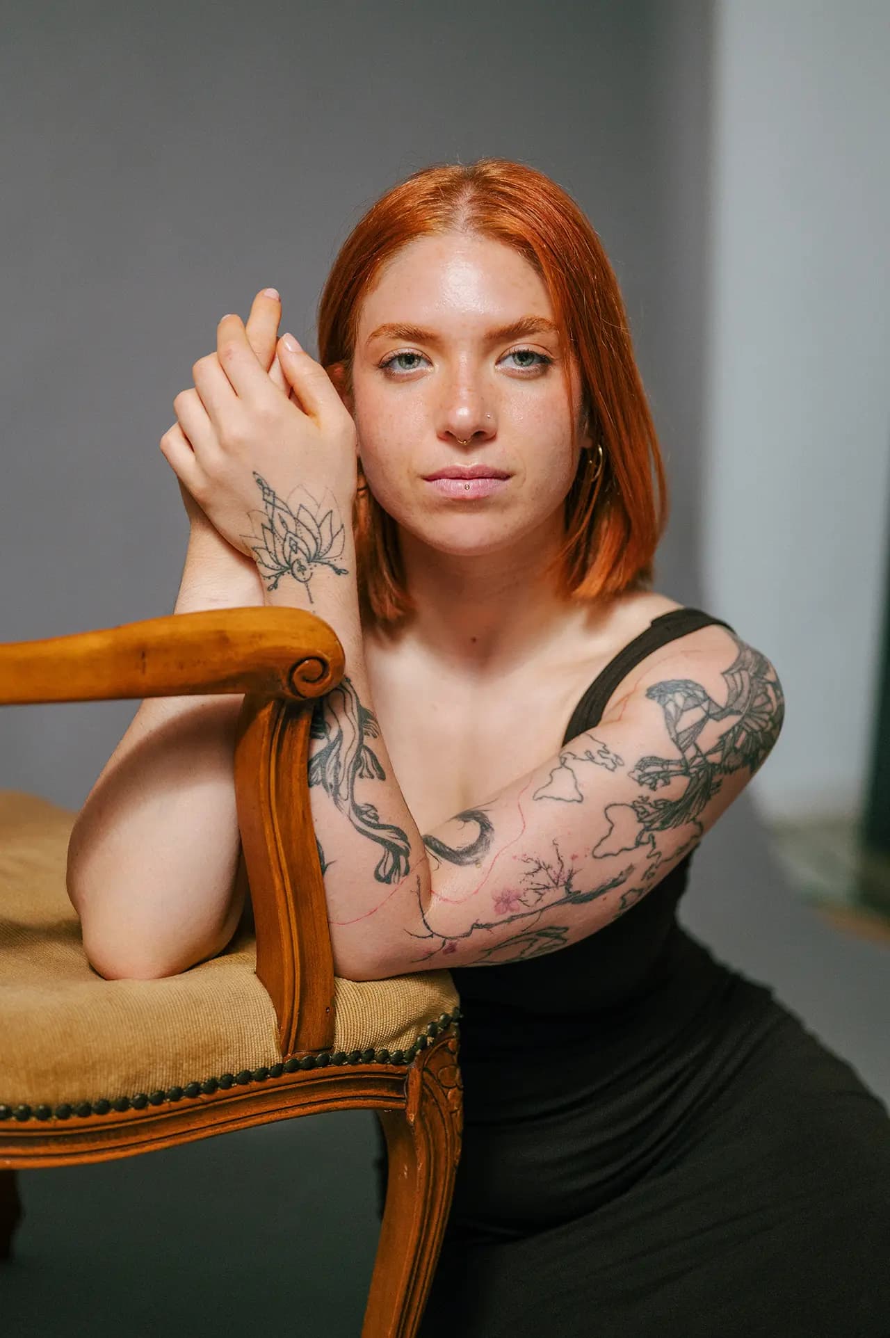
Goal: a natural, flattering portrayal of the person. The focus is on correct skin tones, bright eyes and a pleasant aesthetic.
Step 1: Correct the basics
White balance: the most important thing for natural skin tones. Use the eyedropper on a white or grey area (e.g. the white of the eye) or adjust the Temperature slider manually until skin looks neither too red nor too yellow. Exposure: adjust overall brightness. Lift shadows slightly to soften harsh facial shadows and lower the highlights if bright skin areas blow out.
Step 2: Optimise colors
Increase the Vibrance slider to enhance the colors in the image without unnaturally saturating skin tones. We rarely touch the Saturation slider on portraits.
Step 3: Local adjustments (masks)
Skin retouching: create a brush mask for the skin. Reduce the Texture slider very slightly (-10 to -20) to smooth the skin while preserving pore structure. Remove individual blemishes with the Healing tool. Brightening eyes: create another brush mask for the iris. Raise exposure and saturation a touch to make the eyes pop.
Step 4: Finishing touches
Crop the image if needed for a stronger composition. A subtle sharpening focused only on the eyes and hair can round out the image.
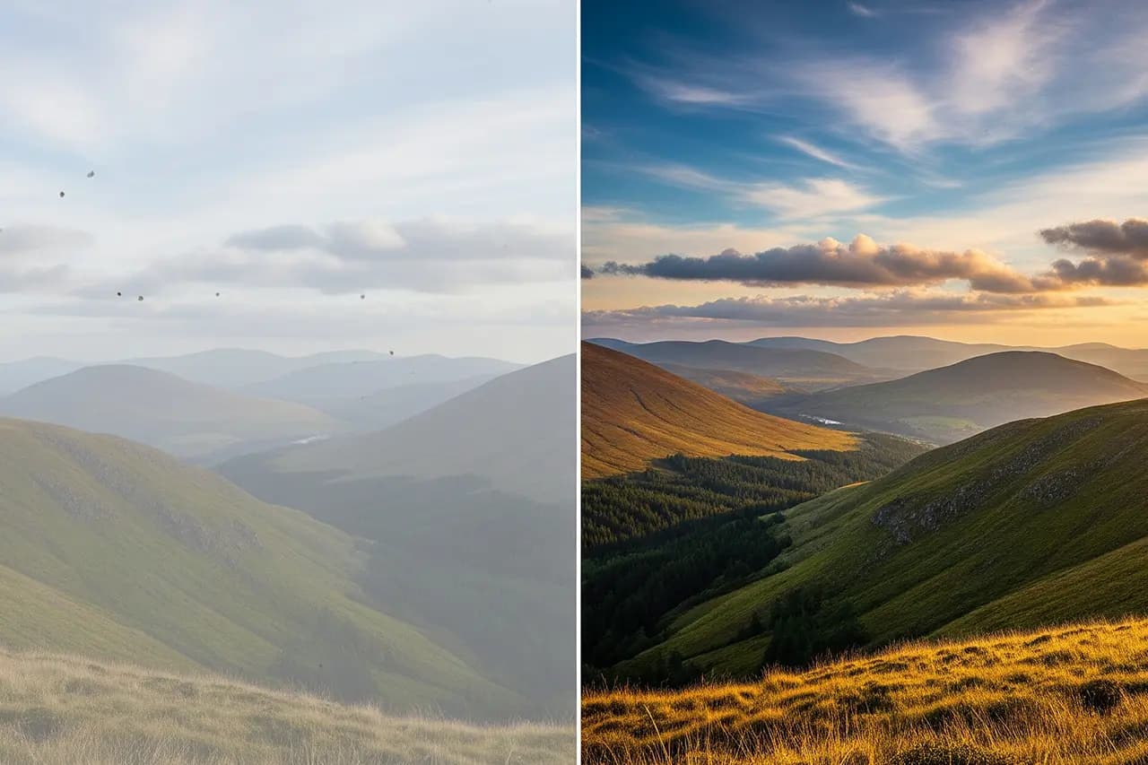
Example 2: Landscape photo
Landscape: before and after editing
Goal: reinforce the mood and breadth of the scene. A dramatic sky, sharp foreground details and harmonious colors are often the target.
Step 1: Set the composition
Straighten: level the horizon. This is essential in landscape work. Crop: consider whether a different crop (e.g. a wider panoramic format) suits the scene better.
Step 2: Global adjustments for depth
Highlights & Shadows: lower highlights to recover detail in clouds. Lift shadows to reveal detail in the foreground (e.g. rocks, plants). Dehaze & Clarity: use the Dehaze slider gently to reduce haze and add depth. Raise Clarity to emphasise textures in rocks, trees and clouds.
Step 3: Local adjustments (masks)
Sky: use the "Select Sky" function or a graduated filter. Lower exposure here slightly and raise contrast to make the sky more dramatic. Foreground: use another mask (e.g. brush or inverted graduated filter) to brighten the foreground specifically and draw the viewer's eye into the image.
Step 4: Color design
Use the HSL panel to refine colors. Saturate the blues in the sky, adjust the greens of the vegetation and aim for a harmonious palette that fits the mood (e.g. warm tones for a sunset).
Example 3: Real-estate photo
Real estate: before and after editing
Goal: show the room bright, inviting, large and realistic. Straight lines, clean colors and a clear view matter here.
Step 1: Geometric corrections
Lens correction: activate automatic lens correction first to remove barrel or pincushion distortion from your wide-angle lens. Transform: use the "Transform" panel (Upright tool) to straighten converging lines. The "Auto" or "Guided" function is gold here for getting walls and furniture perfectly vertical and horizontal.
Step 2: Brightness and contrast
The alpha and omega is a bright, airy room. Lift the Shadows strongly to illuminate dark corners. Drop the Highlights drastically to reveal detail outside the window. The aim is a balanced look almost like an HDR image.
Step 3: Clean colors
Correct the white balance so white walls and ceilings look neutral and not yellowish or bluish. Use the eyedropper on a white wall for this.
Step 4: Detail and clean-up
Boost sharpness for a clear, defined image. Use the Healing tool to remove distracting elements like outlets, cables or stains on the wall.
Example 4: Reportage photo
Reportage: before and after editing
Goal: preserve authenticity and the story of the moment. Editing should be subtle and supportive here, not distorting.
Step 1: Focus on the story
Crop: crop the image so all distracting elements are removed and the viewer's focus is drawn to the central action or main character.
Step 2: Define the mood
Adjust Exposure and Contrast to underline the emotional mood. A darker, higher-contrast edit can create tension, while a brighter, softer edit creates a positive atmosphere.
Step 3: Restrained color
Reportage images often have more impact when colors are not too punchy. A slight reduction in saturation or vibrance can emphasise the documentary character. A black-and-white conversion is a classic technique in reportage to remove color distraction and direct attention to emotion, form and moments.
Step 4: Visual guidance
A very subtle vignette (edge darkening) can help guide the viewer's eye gently to the centre of the action without being intrusive.
11
Frequent questions
FAQ: Answers to Your Questions
Here are answers to some of the most common questions beginners ask on their journey into photo editing.
Do I really have to shoot in RAW?+
You don't have to, but it's highly recommended if you want the best possible quality and maximum flexibility in editing. The RAW format is like a digital negative containing all image information. For quick snapshots you want to share on social media right away, JPEG can be entirely sufficient.
Which software is best to start with?+
For most beginners Adobe Lightroom (the cloud version) is the best starting point. The interface is very intuitive, your photos are automatically backed up in the cloud and synced across devices, and you can fully focus on editing without worrying about complex file management.
Can editing rescue a truly bad photo?+
Only to a certain extent. Editing can make a good photo great, but it rarely turns a technically bad photo into a good one. A heavily out-of-focus, blurry or completely wrongly focused image usually can't be saved. The most important rule remains: try to capture the best possible photo in camera ("Get it right in camera").
How long does it take to get good at editing?+
You can learn the basic tools and a simple workflow over a weekend. Truly becoming "good" and developing your own consistent style is an ongoing process. But that's the beauty of it: it's a creative journey that's fun, and you learn something with every image you edit.
Do presets cost money? And are they worth it?+
There are countless free and paid presets. They can definitely be worth it to save time, achieve a consistent look across a photo series or discover new editing styles. But always view them as a starting point, not the final solution. Almost every preset needs to be adjusted to the specific photo to look its best.
What's the difference between Lightroom Classic and Lightroom (CC)?+
The short answer: Lightroom Classic is the desktop program where you store your photos locally on your hard drive. It's more comprehensive and aimed at a professional workflow. Lightroom (CC) is the cloud service that stores your photos online and syncs them across desktop, phone and tablet. It's simpler and more mobile.
12
Conclusion
Your Path to Photo Editing
Congratulations! You now have a comprehensive overview of the world of photo editing. From the fundamentals through software choice to practical workflows and tips for different photo genres — you have all the tools to take your first steps.
Remember: editing is a journey, not a destination. Every photo you edit makes you a little better. Every mistake you make is a lesson. And every success motivates you for the next step.
Start with the basics. Practice on your own photos. Experiment without fear — thanks to non-destructive editing you can't break anything. Develop your own style, but take your time. The best photographers needed years to find their voice.
Above all: have fun! Photo editing is a creative process that lets you bring your vision to life. It's the modern darkroom where good photos become great images.
Now it's up to you. Take your camera, shoot in RAW, download Lightroom and start your journey. You'll be surprised how quickly you progress and how much fun it is to make your photos shine.
Good luck and enjoy editing your images!
From my workflow
35mm & 120mm film presets
Portra, Kodak Gold, Velvia, HP5 & more — ready-made XMP presets for Lightroom Classic and mobile.
Transparency notice: This article contains affiliate links. If you buy through them I earn a small commission at no extra cost to you. Editorial content is unaffected.
◆ Newsletter
Stay in the loop.
Camera and photography news, honest gear tests and new articles — in your inbox. Infrequent but relevant. No spam, unsubscribe anytime.